Antoine Audiaul & Manuel Warosz are a graphic design duo, studio and both professional & personal partners.
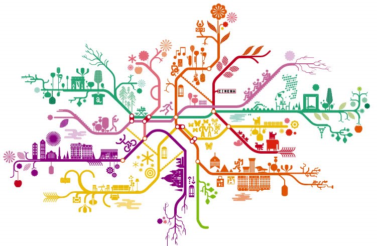
The pair work and live in Paris, where they have created some stunning work over the years. Recurring themes that seem to run through each of their pieces is the use of flowing lines, of organic feel, often though with more structured lineal lines like those used in their version of the Paris subway map.
 Above: Antoinne et Manuel's version of the Paris Metro Map
Colour is also used to great effect in all of their pieces, a great example being the invites and catalogue designs created for Christian Lacroix that they are well known for. When observing their work I can also see how they like to toy with geometric shapes and play around with contrasts between soft and sharp edges. Their pieces are always printed in the highest of quality, which seems to add more class and value to what they do, using techniques like foil blocking & die-cutting.
 Above: One of their Christian Lacroix invites from 2007
Their design work seems mostly to have been constructed digitally although many pieces have been illustrated by hand, such as their ‘Photographier’ poster designed for the Collection Lambert en Avignon in 2002, which happens to be one of my favourite pieces of theirs.

I Love how the piece, along with others designed for Lambert en Avignon, were drawn completely with felt tip pens, often thought of as a child’s artistic tool, which they have picked up and utilised so perfectly when other designers simply shy away from using such a material.
The pair have also delved into other areas such as furniture design, something that only makes me admire them more for their skills.